-
- Digital Marketing
-
 Perf. Marketing
 E-mail Marketing
 PPC Services
 Video Marketing
 Influencer Marketing
- Social Media
 Facebook Marketing
 Instagram Marketing
 Twitter Marketing
 Pinterest Marketing
 TikTok Marketing


-
- Digital Marketing
-
Perf. Marketing
- E-mail Marketing
- PPC Services
- Video Marketing
- Influencer Marketing
- Social Media
- Facebook Marketing
- Instagram Marketing
- Twitter Marketing
- Pinterest Marketing
- TikTok Marketing
Blog
Responsive Web Design in Dubai: Why It Matters in 2026

Want a Quick Summary?
Summarize this article instantly with ChatGPT.
Most website visitors in Dubai are arriving on a phone, not a desktop. A site designed primarily for a large screen and only loosely adjusted for mobile tends to frustrate the majority of its actual visitors, which directly affects both conversion and how the site performs in search results. Responsive design is not an optional polish anymore. It is the baseline standard a website needs to meet.
This guide covers what responsive design actually means, why it carries particular weight in this specific market, and what to look for to make sure it is genuinely done well, not just claimed.
What Responsive Web Design Actually Means
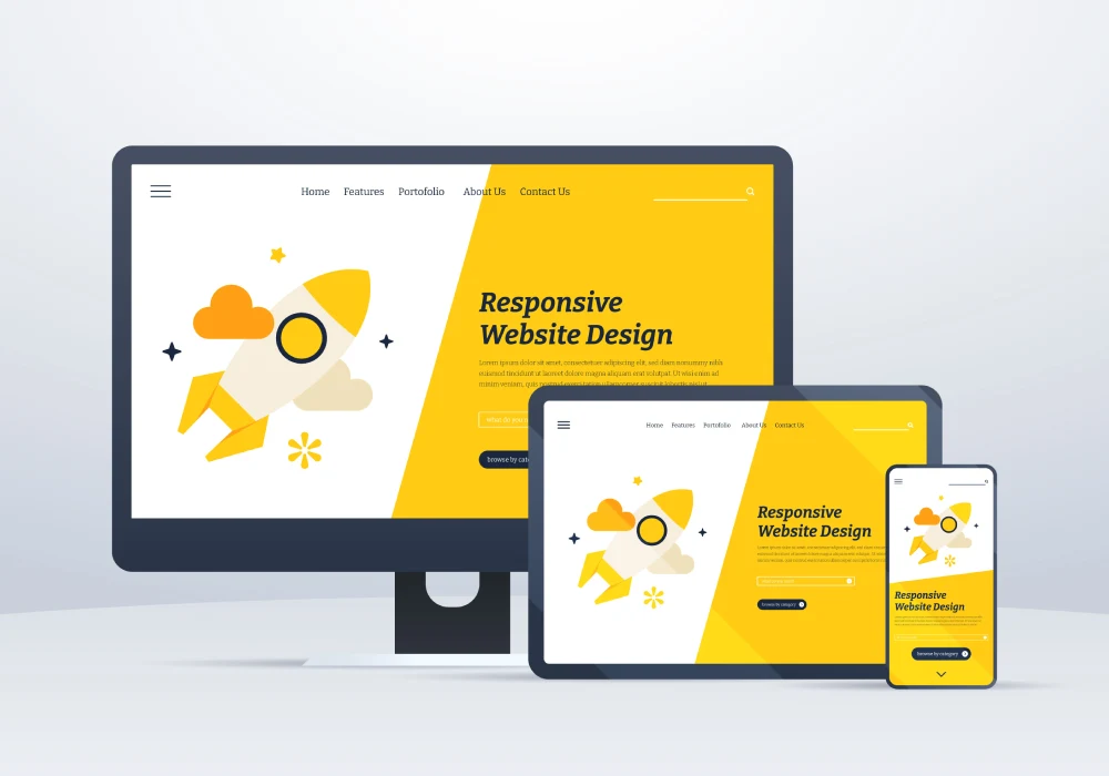
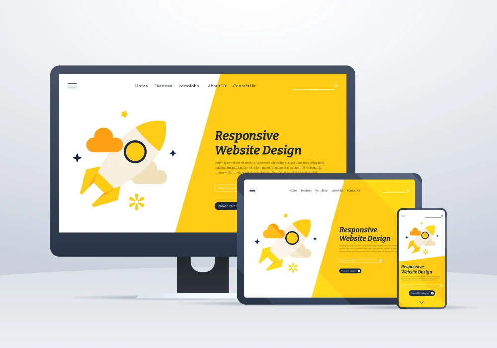
Responsive design means a website automatically adjusts its layout, images, and navigation based on the device and screen size someone is using, rather than displaying a fixed layout that simply shrinks awkwardly on a smaller screen. A properly responsive site works cleanly whether someone is viewing it on a large desktop monitor, a tablet, or a phone, without separate, duplicated versions of the site to maintain.
Why This Matters Especially in Dubai's Market
Mobile usage dominates internet browsing and search behavior in the UAE, with the large majority of property, retail, and general business searches happening on a phone rather than a desktop. A site that performs poorly on mobile is failing the majority of its actual visitors, not a minor edge case. Given how internationally diverse and mobile-reliant Dubai's audience is, a slow, awkward mobile experience often means losing a visitor to a competitor's site within seconds, before they even have a chance to properly evaluate what is being offered.
Core Technical Approaches
Fluid Grids and Flexible Layouts
Rather than fixed pixel widths, a responsive site uses flexible, proportion-based layouts that adjust smoothly across different screen sizes, avoiding the awkward, cramped appearance of a desktop layout simply squeezed onto a small screen.
Breakpoints
Breakpoints define specific screen width thresholds where the layout shifts to a different arrangement, moving from a multi-column desktop layout to a simplified, single-column mobile layout, for example. Well-chosen breakpoints ensure the site looks intentional and clean at every common device size, not just at a couple of specific dimensions the design happened to be tested on.
Flexible Images and Media
Images and video need to scale appropriately without slowing down load times or displaying awkwardly cropped or distorted on smaller screens. This often involves serving appropriately sized image files for different devices, rather than sending a large desktop-sized image to a phone unnecessarily.
Mobile-First Design Approach
Many strong responsive builds start by designing for the smallest screen first, then progressively enhancing the layout for larger screens, rather than designing for desktop and attempting to compress that design down afterward. This approach tends to produce a cleaner, more genuinely considered mobile experience, since mobile constraints shape the design from the very beginning rather than being treated as an afterthought.
Testing Across Real Devices
Responsive design should be tested on actual physical devices, not just a browser's simulated resize tool, since real devices reveal genuine performance issues, touch interaction problems, and rendering quirks that a simulated preview can miss entirely. Testing across a reasonable range of common phone and tablet sizes, along with different browsers, catches problems before real visitors encounter them.
Responsive Design and SEO
Search engines prioritize mobile-friendly websites significantly in how they rank results, given how dominant mobile search has become. A site that is not properly responsive risks weaker search visibility, independent of how strong its actual content might be. Site speed also factors in heavily, and a genuinely well-built responsive site, with properly optimized images and clean code, tends to load faster, which further supports both user experience and search performance.
Common Mistakes
- Treating mobile as an afterthought, testing only on desktop and making minor adjustments for mobile at the very end
- Using oversized images that load slowly on mobile connections, even if the layout itself technically adjusts correctly
- Setting breakpoints based only on a couple of common device sizes, leaving the layout awkward on less typical screen dimensions
- Relying solely on a browser's resize simulation instead of testing on actual physical devices
- Cramming too much content or too many navigation options into a mobile layout, creating a cluttered, difficult-to-use experience
Getting Started
In a market as mobile-heavy as Dubai's, responsive design is foundational, not optional. Prioritize a mobile-first approach, test genuinely across real devices, and treat site speed and image optimization as core parts of the responsive design process, not an afterthought addressed only if something looks broken.
Frequently Asked Questions
Is responsive design the same as having a separate mobile version of a website?
No. A separate mobile site is a distinct version maintained independently, while responsive design uses one single site that automatically adjusts its layout based on the device, which is generally easier to maintain and keep consistent over time.
Does responsive design actually affect search engine rankings?
Yes, significantly. Search engines factor mobile-friendliness heavily into ranking decisions, given how dominant mobile search traffic has become, making responsive design a meaningful factor in overall search visibility.
How can I tell if my current website is genuinely responsive?
Test it directly on several real devices of different sizes, not just a desktop browser's resize tool, checking that layout, navigation, and images all adjust cleanly and remain easy to use at each size.
Does responsive design slow down a website?
Not inherently, and a well-built responsive site with properly optimized images typically loads faster than a poorly built fixed-width site struggling to adapt to different screens. Poor implementation, not responsiveness itself, is usually the actual cause of slow load times.
Looking for Measurable Business Growth?
Partner with BrandStory for end-to-end digital & creative excellence.


Are You Looking for Growth?
Free instant digital marketing audit and improve performance.
Get Graded Today
Transform Your Digital Growth with BrandStory
From SEO, PPC, social media marketing, and content marketing to website development, branding, and lead generation, BrandStory delivers result-driven digital marketing services in Dubai and across the UAE, helping businesses attract, engage, and convert more customers.
Trusted by 1000+ leading brands in Dubai and globally including:




Related Blogs

Web Design SEO Services: Why Integration Matters
In today's competitive online marketplace, integrating web design and SEO services is essential for achieving optimal vi...

Importance of Web Design and Advertising Integration
In today's digital landscape, combining web design and advertising is essential for effective branding. Creating visuall...
Interactive Web Design: Enhancing User Engagement
In today's digital landscape, interactive web design is vital for businesses seeking to create memorable user experience...

The Importance of an Education Web Design Agency
In today's digital age, educational institutions must prioritize specialized web design to enhance their online presence...

The Importance of Branding Web Design for Businesses
In today's competitive landscape, having a strong branding web design is essential for businesses. A well-crafted websit...
Web Application Design and Development: Importance in Today's Landscape
Web application design and development is essential in today's competitive environment. By prioritizing user experience ...