-
- Digital Marketing
-
 Perf. Marketing
 E-mail Marketing
 PPC Services
 Video Marketing
 Influencer Marketing
- Social Media
 Facebook Marketing
 Instagram Marketing
 Twitter Marketing
 Pinterest Marketing
 TikTok Marketing


-
- Digital Marketing
-
Perf. Marketing
- E-mail Marketing
- PPC Services
- Video Marketing
- Influencer Marketing
- Social Media
- Facebook Marketing
- Instagram Marketing
- Twitter Marketing
- Pinterest Marketing
- TikTok Marketing
Blog
How to Choose a Responsive Web Design Agency
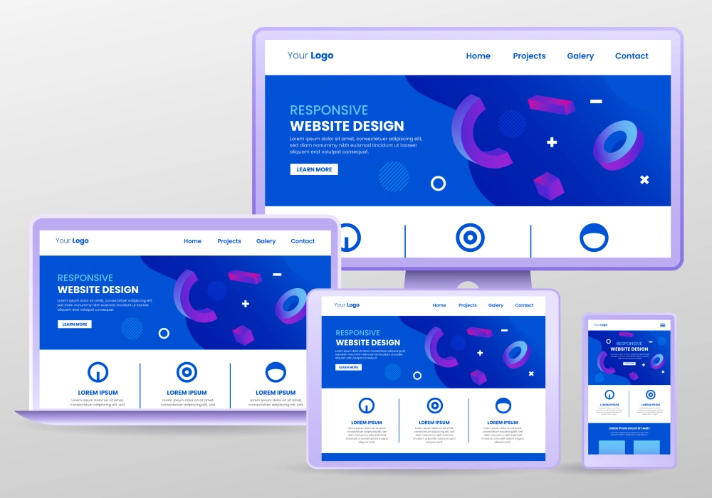
Want a Quick Summary?
Summarize this article instantly with ChatGPT.
Nearly every web design agency claims their sites are responsive. That claim alone tells you very little, since "responsive" ranges from a genuinely thoughtful, mobile-first build to a desktop layout that technically shrinks without breaking, but still feels clumsy and afterthought-driven on an actual phone. Evaluating an agency's real responsive design capability takes more than reading the word on their homepage.
This guide covers what genuine responsive capability actually looks like, and how to evaluate an agency properly before hiring, without recommending or ranking any specific provider.
What "Responsive" Should Actually Mean From an Agency
A genuinely responsive site adjusts its layout, navigation, and images cleanly across screen sizes, loads quickly on mobile connections, and feels intentionally designed for a phone, not just technically functional on one. It should be built with a mobile-first mindset, considering the smallest screen constraints from the very start rather than compressing a desktop design down afterward as an afterthought.
The Fastest Way to Evaluate an Agency's Responsive Capability
Before anything else, pull up the agency's own website on your phone. If their own site feels slow, cluttered, or awkward on mobile, that is a direct, honest signal about their actual standards, regardless of what their pitch deck claims. Do the same with several examples from their portfolio, not just glancing at them on a desktop browser, but genuinely navigating them on your own phone as a real user would.
What to Look for Beyond the Obvious
A Genuine Mobile-First Approach
Ask directly whether they design for mobile first and expand up to desktop, or design for desktop first and adapt down. A mobile-first approach tends to produce a more genuinely considered small-screen experience, since mobile constraints shape decisions from the very beginning.
Real Attention to Site Speed and Performance
Responsive layout alone does not guarantee a fast site. Ask how the agency approaches image optimization, code efficiency, and overall load time, since a beautifully responsive but slow-loading site still loses visitors quickly, particularly on mobile networks.
A Genuine Device Testing Process
Ask whether they test on actual physical devices across a reasonable range of screen sizes and browsers, not just a browser's simulated resize tool. Real device testing catches genuine rendering and interaction issues a simulation often misses.
Thoughtful Handling of Complex Elements
Ask specifically how they handle challenging responsive elements: data tables, complex navigation menus, or image galleries, since these are where weaker responsive implementations tend to break down or become genuinely unusable on a small screen.
Questions to Ask During the Pitch
- Do you design mobile-first, or adapt a desktop design down afterward?
- How do you approach image optimization and overall site speed on mobile specifically?
- Do you test on real physical devices, and across which range of screen sizes and browsers?
- Can you show me how you have handled complex elements like data tables or navigation menus responsively in past work?
- What happens if a client reports a specific device or browser rendering issue after launch?
Red Flags to Watch For
- The agency's own website performs poorly or feels clumsy on mobile
- Vague or evasive answers about their actual testing process
- No clear approach to image optimization or site speed as part of the responsive design process
- Portfolio examples that look fine on desktop but break down noticeably when actually viewed on a phone
What It Typically Costs
| Scope | Typical Range |
|---|---|
| Small business website, responsive build | $2,000 to $10,000 |
| Mid-size business site with custom functionality | $10,000 to $30,000 |
| Large-scale or ecommerce platform | $30,000 and above, scope dependent |
Responsive design should be considered a standard, included part of any modern web design project rather than a separate line-item add-on, and it is worth being cautious of any proposal that prices it separately as an optional extra.
Common Mistakes When Hiring for Responsive Design
- Accepting the word "responsive" at face value without personally testing the agency's own site and portfolio on a real phone
- Not asking about site speed and image optimization specifically, assuming a responsive layout automatically means a fast one
- Skipping questions about actual device testing process, relying entirely on the agency's assurance without verification
- Treating responsive design as an optional add-on rather than a foundational, non-negotiable standard for any new website
Getting Started
The most reliable way to judge an agency's responsive design capability is to test it yourself, on your own phone, before you ever sign a contract. Look beyond the word "responsive" itself into genuine mobile-first thinking, real performance optimization, and an actual device testing process, and you will get a far more accurate picture than any claim made in a pitch.
Frequently Asked Questions
Should responsive design cost extra on top of a standard web design project?
No, it should be considered a standard, included part of any modern website build, not a separate optional add-on. Be cautious of any proposal pricing it separately.
How can I personally verify an agency's responsive design quality before hiring them?
Test their own website and several portfolio examples directly on your own phone, navigating as a real user would, rather than relying solely on how the sites look in a desktop browser or a pitch presentation.
Is mobile-first design significantly better than adapting a desktop design down?
It often produces a more genuinely considered mobile experience, since mobile constraints shape design decisions from the start rather than being addressed as an afterthought once the desktop version is already finished.
Does a responsive website automatically load quickly on mobile?
Not automatically. Responsive layout and site speed are related but distinct considerations, and a poorly optimized responsive site can still load slowly, particularly if images and code are not properly optimized for mobile performance.
Looking for Measurable Business Growth?
Partner with BrandStory for end-to-end digital & creative excellence.


Are You Looking for Growth?
Free instant digital marketing audit and improve performance.
Get Graded Today
Transform Your Digital Growth with BrandStory
From SEO, PPC, social media marketing, and content marketing to website development, branding, and lead generation, BrandStory delivers result-driven digital marketing services in Dubai and across the UAE, helping businesses attract, engage, and convert more customers.
Trusted by 1000+ leading brands in Dubai and globally including:




Related Blogs

Web Design SEO Services: Why Integration Matters
In today's competitive online marketplace, integrating web design and SEO services is essential for achieving optimal vi...

Importance of Web Design and Advertising Integration
In today's digital landscape, combining web design and advertising is essential for effective branding. Creating visuall...
Interactive Web Design: Enhancing User Engagement
In today's digital landscape, interactive web design is vital for businesses seeking to create memorable user experience...

The Importance of an Education Web Design Agency
In today's digital age, educational institutions must prioritize specialized web design to enhance their online presence...

The Importance of Branding Web Design for Businesses
In today's competitive landscape, having a strong branding web design is essential for businesses. A well-crafted websit...
Web Application Design and Development: Importance in Today's Landscape
Web application design and development is essential in today's competitive environment. By prioritizing user experience ...