-
- Digital Marketing
-
 Perf. Marketing
 E-mail Marketing
 PPC Services
 Video Marketing
 Influencer Marketing
- Social Media
 Facebook Marketing
 Instagram Marketing
 Twitter Marketing
 Pinterest Marketing
 TikTok Marketing


-
- Digital Marketing
-
Perf. Marketing
- E-mail Marketing
- PPC Services
- Video Marketing
- Influencer Marketing
- Social Media
- Facebook Marketing
- Instagram Marketing
- Twitter Marketing
- Pinterest Marketing
- TikTok Marketing
Blog
Bilingual Logo Design Tips: Guide to Dual-Script Brand Architecture
.webp)
Want a Quick Summary?
Summarize this article instantly with ChatGPT.
In multicultural commercial environments across the Middle East, Asia, and North Africa, enterprise brands rarely communicate in a single language. Companies operating in dynamic international hubs like Dubai, Riyadh, Singapore, and Hong Kong must routinely address diverse demographics that read distinct scripts in opposing directions. A mark designed strictly for Latin typography fails when retrofitted into Arabic, Chinese, or Cyrillic characters without careful strategic planning.
Engineering a dual-script corporate mark demands far more than basic software translation. High-performing bilingual logo design requires balancing asymmetrical typographic anatomy, aligning divergent reading directions, equalizing optical visual weight, and preserving unified brand personality across distinct linguistic scripts.
Overview Matrix: Core Asymmetries Between Script Systems
Designing across multiple languages requires understanding the structural differences between Latin and non-Latin typographic traditions:
| Typographic Dimension | Latin Script Standard | Arabic Script Standard | East Asian (CJK) Script Standard |
|---|---|---|---|
| Reading Flow | Left-to-right (LTR) linear scanning. | Right-to-left (RTL) fluid scanning. | Left-to-right horizontal or top-to-bottom vertical. |
| Structural Architecture | Modular, isolated characters with rigid cap-heights. | Continuous cursive baseline with dynamic ligatures. | Uniform square bounding boxes (ideographic blocks). |
| Letter Cases | Dual casing with uppercase and lowercase forms. | Single casing system with contextual letter positions. | Single casing system with thousands of distinct glyphs. |
| Phonetic Anchors | Standard letters with occasional accent marks. | Crucial diacritical dots (I'jam) that change word meaning. | Complex interior radicals and variable stroke counts. |
Tip 1: Prioritize Optical Parity Over Metric Measurement
The single most widespread technical mistake in bilingual identity projects is setting both languages to identical digital point sizes or millimeter heights. Metric equality produces immediate optical disharmony.
- Counter Space and Visual Mass: Latin capital letters feature large, open internal counter spaces and flat vertical stems, making them appear bold and heavy. Arabic script, by contrast, flows along a low horizontal baseline with smaller loops and delicate ascending strokes. Setting an Arabic wordmark at the identical point size as a bold English font leaves the Arabic looking weak and subordinate.
- Optical Calibration Protocol: Adjust font sizing, letter tracking, and stroke thickness manually until both scripts project equal visual presence from five meters away, regardless of what the software font-size palette indicates.
Tip 2: Match Personality and Stroke Contrast Ratios
Both scripts must express the same corporate voice, technical era, and emotional demeanor. Clashing typographic personalities create cognitive dissonance for multilingual consumers.
- Stroke Weight Modulation: If the primary Latin wordmark utilizes an ultra-clean geometric sans-serif with a single uniform stroke width, the Arabic or Asian equivalent must mirror that monoline construction, often drawing from geometric Kufic or modern gothic styles.
- Contrast Dynamics: If the primary mark features a high-contrast luxury serif with razor-thin hairlines and heavy vertical downstrokes, the complementary script must incorporate equivalent calligraphic pen-angle variations to maintain an elevated, editorial tone.
- Corner Radiuses and Terminal Treatment: Ensure that rounding on stem terminals, ink traps, and apex angles matches across both language sets. Sharp 90-degree corners in Latin text should not be paired with soft, rounded bulb terminals in the secondary script.
Tip 3: Architect Adaptable Layout Lockups
A static bilingual logo will fail across modern responsive interfaces. Design teams must build a versatile modular system that provides tailored lockup variations for different digital and physical surfaces:
| Lockup Configuration | Structural Mechanics | Primary Channel Applications |
|---|---|---|
| Stacked Centered Lockup | Primary local script placed on top, secondary global script underneath. | Mobile applications, social media avatars, square product packaging. |
| Horizontal Split Lockup | Visual symbol centered as a bridge between right-reading and left-reading text. | Desktop website headers, corporate stationery, airport directional signs. |
| Single-Script Responsive Mode | Dynamic software interface that displays only the user's active session language. | High-density software dashboards, localized mobile checkout screens. |
| Integrated Typographic Hybrid | Latin and non-Latin letterforms merged into an interlocking monogram cipher. | Luxury fashion houses, boutique hospitality, private banking seals. |
Tip 4: Engineer the Central Symbol as an Optical Bridge
When an abstract symbol, brandmark icon, or monogram accompanies dual-language typography, that mark must function as a neutral visual anchor.
- Directional Balance: Avoid symbols that lean aggressively toward the right or left unless intentional. A symbol that slants heavily to the right complements left-to-right English reading, but visually fights against right-to-left Arabic optical scanning.
- Symmetrical Anchoring: Central placement of the icon allows native readers of either script to engage with the symbol first before tracking naturally toward their native language text.
- Shared Geometric DNA: The internal curve radiuses, line weights, and negative space ratios of the central icon must be derived directly from the character strokes of both scripts.
Tip 5: Preserve Diacritics and Radical Clear Space
In non-Latin writing systems, minor marks are not optional decorative flourishes; they are foundational linguistic components.
- Arabic Diacritical Dots (Nuqtat): The presence, count, and vertical placement of dots differentiate entirely different letters. Crowding Arabic typography against Latin baselines often forces designers to shrink or shift dots, altering phonetics or creating unreadable forms.
- Chinese and Japanese Radicals: Complex characters contain dozens of fine interior strokes. Packing these glyphs into tight corporate boxes causes stroke merging when rendered at small digital dimensions.
- Dedicated Buffer Zones: Establish strict clear-space guidelines that protect diacritical marks from being encroached upon by surrounding Latin typography or structural container borders.
Tip 6: Stress-Test Across Real-World Viewports
Validate bilingual assets through rigorous operational testing before public deployment:
- The 32-Pixel Viewport Test:
Scale the bilingual mark down to 32 pixels in height. If one script remains legible while the other dissolves into an unreadable horizontal line, adjust optical weights and baseline spacing to restore balance.
- The Monochrome Silhouette Test:
Strip all color, drop shadows, and gradients. Render the mark in solid black on white, and solid white on black. Both scripts must maintain clear internal counter spaces and clean silhouettes without bleeding together.
- The Native Reader Review:
Never rely solely on machine translation or non-native design opinions. Always submit candidate bilingual lockups to native speakers of both languages to confirm linguistic accuracy, cultural appropriateness, and natural reading rhythm.
Bilingual Logo Quality and Parity Matrix
Use the analytical matrix below during identity audits to evaluate whether a bilingual logo achieves visual balance, functional adaptability, and cultural resonance:
| Audit Requirement | Quality Benchmark | Verification Standard |
|---|---|---|
| Optical Balance | Neither script visually overpowers or diminishes the other in mass. | Five-meter distance blur test and monochrome silhouette review. |
| Stylistic Consistency | Both languages share identical stroke weight logic, contrast, and geometry. | Side-by-side terminal, corner, and stem comparison. |
| Linguistic Integrity | All letter connections, baselines, and diacritics are grammatically sound. | Formal native-speaker linguistic audit and sign-off. |
| Responsive Modular Tiers | Guidelines include stacked, horizontal, and isolated symbol variations. | Front-end web header and mobile viewport sandbox testing. |
| Vector Construction | Master source assets built purely with clean, optimized SVG/EPS paths. | Outline mode node audit in vector illustration software. |
Engineering Global Visual Authority
Bilingual logo design is a complex balancing act of cultural respect and precision visual engineering. By rejecting simple metric sizing, matching stroke contrast ratios, anchoring layouts with neutral visual symbols, and designing responsive modular lockups, organizations create cohesive identities that speak with equal clarity across diverse global markets. A well-engineered bilingual logo establishes instant consumer trust, eliminates regional friction, and projects authoritative permanence across every commercial touchpoint.
Looking for Measurable Business Growth?
Partner with BrandStory for end-to-end digital & creative excellence.


Are You Looking for Growth?
Free instant digital marketing audit and improve performance.
Get Graded Today
Transform Your Digital Growth with BrandStory
From SEO, PPC, social media marketing, and content marketing to website development, branding, and lead generation, BrandStory delivers result-driven digital marketing services in Dubai and across the UAE, helping businesses attract, engage, and convert more customers.
Trusted by 1000+ leading brands in Dubai and globally including:




Related Blogs

Brand Perception Explained: Commercial, and Behavioral Mechanics
In modern commercial strategy, organizations frequently confuse what they communicate about themselves with what the m...
.webp)
What Affects Branding Cost: The 8 Critical Determinants
In modern corporate finance and commercial strategy, branding is frequently miscategorized as a subjective aesthetic e...
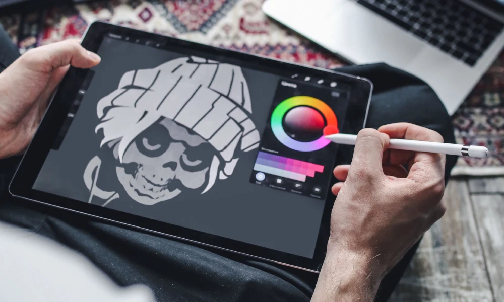
Cheap Logo vs. Professional Branding: Strategic, Financial, and Legal Comparison
In the early stages of establishing an enterprise, business leaders frequently face a critical procurement decision: s...
.webp)
Freelancer vs. Agency Branding Cost: Commercial Comparison Blueprint
When leadership teams, founders, and marketing directors set out to build, refresh, or scale a corporate brand, the pr...
.webp)
Packaging Design Cost in UAE: Commercial Guide to Pricing Tiers
In the United Arab Emirates, retail packaging serves as an essential customer conversion engine. Whether showcased on ...
.webp)
Brand Strategy Cost in UAE: Budgeting, Methodology, and Deliverables
In the United Arab Emirates, corporate success rarely hinges on visual presentation alone. While a polished logo, refi...